One Bite Design
  • Home
  • About
  • Services
  • Logo Design Brand Packages
  • Portfolio
    • Full Brands
    • Logo Designs
    • Photography
    • Business Card Designs
    • Apparel Design >
      • Apparel Design
  • FAQ's
  • Testimonials
  • Contact
  • One Bite BLOG

Your Guide to Changing Your Branding - Guest Blog

21/8/2018

0 Comments

 
Changing your branding is not something to be taken lightly and should only be done when necessary. That’s because your brand is how people remember your business. Imagine if McDonald’s suddenly swapped its golden arches for an image of a burger. They suddenly become just a burger shop, without anything to easily differentiate them with their competitors. It’s a similar thing with your business’ branding. By changing your logo, font and colours, you put your customers off balance and it takes time for them to readjust to your new branding image.

However, sometimes changing your branding is the best decision for your business. It may be that you’re offering new services or products, have a change of ownership or your old branding no longer reflects the direction your business is taking. Today we’re going to discuss all you need to know about changing your branding.
Picture

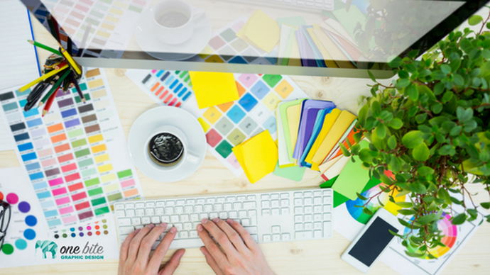
Changing Your Branding: A Beginner’s Guide 101
When you rebrand, it can be a partial or complete rebranding. You can choose between:
  • Replacing the logo, but keeping everything else
  • Changing the colours and font, but keeping the logo
  • Adding phrases to your logo
  •  Expanding your branding with additional colours and graphics
  • Editing the logo​​
    ​
In the end though, your new branding still needs to reflect your business, in that it must:
  • Be consistent
  • Focus on your ideal customer or client
  • Be unique
  • Reflect your brand’s personality
  • Be easily recognisable
  • Tells your business’ story
  • Can be used in many places and in many ways

Pros and Cons of Rebranding
When you alter your branding, you’re doing it with the desire to grow your business. In order to make the right decision, you need to weigh up the pros and cons.

The pros of rebranding include:
  • Get new customers
  • Increased engagement on social media
  • Meet new goals
  • You get to start again!

The cons of rebranding include:
  • You can lose customers
  • You’re no longer instantly identifiable
  • It takes time to rebuild your business’ recognition
  • ​It can be very costly

A great way to promote your business, rebranded or not, is to list it in a directory. Business Networking NZ offers a free NZ business directory listing and it’s a great way to increase your online presence. Come and add your details today!
0 Comments

Screen-printing & Apparel Design

15/8/2018

2 Comments

 
There’s something special about throwing on a t-shirt, or a hoodie, with a logo or personal design printed on it. Nothing beats throwing on a t-shirt with your favourite band’s best album plastered over the front, and noticing another member of the public wearing the same band. Nothing beats throwing on a t-shirt of your favourite brand, and noticing another member of the public wearing the same brand too. You throw each other a look, a knowing smile. You’re part of the same team somehow, a club that you both belong to.

When you start a new job, the logo sitting proudly on your shirt signifies you’ve become part of something new. You can walk into any office and have almost instant comradery with everyone present.

Have you ever created something, like a new business, or an important event? Try throwing on a hoodie with the name and logo of your creation printed ceremoniously on the back. You’ve achieved something great, something tangible. And if someone asks you about your business while you’re wearing it? A bonus advantage of clever marketing and branding.
Picture

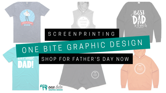
​How do we do it?
Now there’s a number of ways you can get your hot little hands on that specially designed apparel. Here we’re going to break down the three main processes of apparel design (and the one favoured by us at One Bite), so you can make the best choice for your needs. Make your father’s day by giving him a branded T-shirt or hoodie! Better still get him to advertise your business while he’s out and about!
  1. Embroidery
    Not just for grandmothers anymore, embroidery is a basic process where thread is stitched into your custom product so you can rock your logo wherever you go. Think golf polo shirts, jackets and hats. Some logos may have to be altered a little if embroidery is the preferred method though, because it’s a tad difficult to recreate shading using just threads. To us, there’s nothing worse than a logo that doesn’t represent your brand correctly – it’s all about consistency people! It’s also difficult sometimes to get very small text to sew well using embroidery, that’s just the basic limitations of needle and threads. Embroidery is also a little more expensive than screen printing (but you didn’t hear that here!). Lastly, if you’re looking at hoodies or t-shirt, embroidery is often too heavy for certain fabrics, and you’ll get puckering around the logo due to the tension created by the stitching. Not a good look for your fancy new company t-shirts!
  2. Vinyl
    Vinyl printing is all about heat transfer. Letters and designs from coloured vinyl are cut out using a special machine and then heat-pressed onto t-shirt’s to transfer. Vinyl printing uses a combination of pressure and heat – simple and bold. With vinyl, every shirt or hoodie requires individual set up, time consuming for any medium to large quantities, and time equals money. Simple graphics work best with vinyl, think text based pieces, or basic shapes. Need numbers for your rugby team? Use vinyl. Want a detailed logo or photo print? Keep looking. With vinyl you can’t create true gradients, shading, or blending, which means any fine details will get lost.
  3. Screen printing
    There’s no hiding the fact that screen-printing is our favoured approach and I want to take this time to explain why we choose this process over the two above. Firstly, screen printing is a process that uses inks that are applied to apparel (or really just about anything!). The list really could go on forever and examples of screen printing are seen everywhere. The process is called screen printing because a mesh screen with a stencil is used. Each ink colour in a design is pushed through onto your t-shirt, creating a finished logo once combined. The winning selling point that has us shouting about our screen-printing from the roof-tops? The one thing you just can’t get with vinyl or embroidery? It’s all in the details. Detailed design is something that you just can’t get with vinyl or embroidery.

Ok it’s obvious now, screen-printing wins.
Screen printing is the best option in our view as we can create high end designs that include the pièce de résistance - shading and gradients. Detailed logos? No problem. Photos? Done. Cool effects? Bingo. Specific colours that are on brand? Easy. All these effects are nearly impossible with embroidery or vinyl. Plus if you’re printing a bunch of the same item it’s the most cost effective as well, a true winner in our books.

The graphics produced through screen printing should also last for the t-shirt’s life under normal use. To make your custom graphic last the garment’s life, simply flip your garment inside out before chucking it in the wash, and use cold water. Easy.

Get in touch with us today if you’re interested in looking at how One Bite Graphic Design can create the perfect screen-printed item for you and your business. Get in touch with One Bite TODAY! OR better still check out the website!
2 Comments

How To Chose The Best Colours For Your Social Media Posts

8/8/2018

0 Comments

 
Colour - Glorious Colour! Colour can make or break the visual impact of your brand.

Do you like to create your own social media graphics but don’t know where to start? Do you have images and photos that you would like to choose your colours from but are unsure which colours to pick.

While doing this yourself can be cost effective, you can waste a lot of time if you do not know what you are doing. It can also result in graphics that look unprofessional. Graphic designers, like One Bite Design, have an expert eye for what looks good and understand how colours work alone and together. This is something that may not come naturally to everyone or maybe something that people haven’t been taught. Did you know that not all reds ‘go together’ - not all blues ‘are created equal’. Base colours are important.

So let’s look into some reasons and tips why selecting colours from your images / photos to use for your business is important.

3 Important Things To Note When Creating A Graphic 

  1. Choose the right colours
    The first thing you want to consider is the target audience you are wanting to reach with the graphic? Are you a building company where it is predominantly male oriented. Are you marketing to mothers of young children? Your colour choices are likely to be quite different. Also have a think about how you want people to feel when they see your image. Do you want them to be excited and happy? Or perhaps you want them to feel calm and peaceful? You may want to convey solidarity and trust. Colours are capable of creating emotions. Have a look at this website to find some of the emotions related to different colours. 

  2. Colours can create a strong unity within the graphic 
    Having all the colours you use tie in with the chosen image creates unity. The brain is then able to process what it sees easily making the impact of the graphic more beneficial. There isn’t a minimum of colours to select from an image but I advise having no more than 4 colours in the designed graphic. You can either use contrasting colours or you can chose colours that complement each other.  I have found this website helpful for looking at colour combinations.

  3. Be sure to include your logo on your design
    Having your logo somewhere on your design is so important, it keeps your branding consistent and obvious for the world to see the business behind the graphic. The logo you use doesn’t always need to be a full colour / full text version. A watermark version of your logo works just as well. Having multiple versions of your logo is so beneficial when you are designing your own graphics. Check out one of my most popular blogs regarding logo design versions.

So… how do I select a colour from an image?
There are a few good websites that can do this for you but Image Color Picker comes highly recommended. You can upload your own image, use the online colour code from a website, or get the online colour code from a picture via the website link.  You use the online image colour picker to select a colour and get the online Colour Code of the selected pixel. You also get the multiple websafe colour information.

Which colours should I pick out?
Check out the 2 samples (below) of colours picked from the same image. Shout out to Nikki at AmbiDexi for letting me use her product and photo for this example. I am sure that from the first glance you can see which image is more appealing. The product used in this image is bright, fun, young and happy. In the first image that One Bite designed, the colours selected are vibrant and used from the girls tutus. The second image shows colours also picked from the same image but they are far less inviting. The colours in this graphic appear dull and dreary, they do not evoke a happy, exciting time for children. From this example you can clearly see which would be the right colours to use for this design. The distinctions are not always that clear and you may require some professional help. With each design you put out for your business make sure that you are designing it targeted at the right people. This does not only come down to the colours you use but also the image and even the relating text. 
​“Help!' I hear you say, 'I’m overwhelmed!'

Never fear! Help is at hand.  Helen, at One Bite Graphic Design, with 20 years experience, knows very well what colours work best to bring out of images. If you do not have either the time or desire to pick colours from your images for your design work, get in touch with One Bite Graphic Design today and I’ll apply my creative eye and understanding of how colours work to bring out the very best with your images, logo and over all branding.
contact helen now
0 Comments

    One Bite  Design BLOG

    Check out these amazing blogs. Loads of great information and tips.

    Categories

    All
    Branding
    Business Tips
    Graphic Design Tips
    Logo Design
    Visual Marketing

    Previous Blogs

    February 2021
    January 2021
    November 2020
    October 2020
    September 2020
    August 2020
    June 2020
    January 2019
    November 2018
    October 2018
    September 2018
    August 2018
    July 2018
    June 2018
    May 2018
    April 2018
    March 2018
    February 2018
    January 2018
    December 2017
    November 2017
    September 2017
    August 2017
    July 2017
    June 2017
    May 2017
    April 2017
    February 2017
    January 2017
    May 2016
    April 2016
    January 2016

      GET IN TOUCH

    Submit

​Home
About
Contact
​Blog

​Thanks so much for taking the time to look around the One Bite Design website.
​We are your one stop branding specialists taking the stress out of your branding needs.
No job too big, no job too small... One Bite Design can happily design it all.
© Copyright One Bite Design 2019
  • Home
  • About
  • Services
  • Logo Design Brand Packages
  • Portfolio
    • Full Brands
    • Logo Designs
    • Photography
    • Business Card Designs
    • Apparel Design >
      • Apparel Design
  • FAQ's
  • Testimonials
  • Contact
  • One Bite BLOG