|
Colour - Glorious Colour! Colour can make or break the visual impact of your brand. Do you like to create your own social media graphics but don’t know where to start? Do you have images and photos that you would like to choose your colours from but are unsure which colours to pick. While doing this yourself can be cost effective, you can waste a lot of time if you do not know what you are doing. It can also result in graphics that look unprofessional. Graphic designers, like One Bite Design, have an expert eye for what looks good and understand how colours work alone and together. This is something that may not come naturally to everyone or maybe something that people haven’t been taught. Did you know that not all reds ‘go together’ - not all blues ‘are created equal’. Base colours are important. So let’s look into some reasons and tips why selecting colours from your images / photos to use for your business is important. 3 Important Things To Note When Creating A Graphic
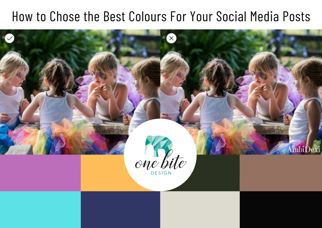
So… how do I select a colour from an image? There are a few good websites that can do this for you but Image Color Picker comes highly recommended. You can upload your own image, use the online colour code from a website, or get the online colour code from a picture via the website link. You use the online image colour picker to select a colour and get the online Colour Code of the selected pixel. You also get the multiple websafe colour information. Which colours should I pick out? Check out the 2 samples (below) of colours picked from the same image. Shout out to Nikki at AmbiDexi for letting me use her product and photo for this example. I am sure that from the first glance you can see which image is more appealing. The product used in this image is bright, fun, young and happy. In the first image that One Bite designed, the colours selected are vibrant and used from the girls tutus. The second image shows colours also picked from the same image but they are far less inviting. The colours in this graphic appear dull and dreary, they do not evoke a happy, exciting time for children. From this example you can clearly see which would be the right colours to use for this design. The distinctions are not always that clear and you may require some professional help. With each design you put out for your business make sure that you are designing it targeted at the right people. This does not only come down to the colours you use but also the image and even the relating text. “Help!' I hear you say, 'I’m overwhelmed!'
Never fear! Help is at hand. Helen, at One Bite Design, with 20 years experience, knows very well what colours work best to bring out of images. If you do not have either the time or desire to pick colours from your images for your design work, get in touch with One Bite Design today and I’ll apply my creative eye and understanding of how colours work to bring out the very best with your images, logo and over all branding.
1 Comment
|
One Bite Design BLOGCheck out these amazing blogs. Loads of great information and tips. Categories
All
Previous Blogs
April 2024
|

