ONE BITE DESIGN
  • Home
  • Services
    • Logo Design Brand Packages
    • Branding & Graphics
    • Print Design
    • Virtual Design Services
    • Funeral & Memorial Design
    • Photography
    • Apparel Design
  • Portfolio
    • Full Brands >
      • Bloom
    • Logo Designs
    • Photography
    • Business Card Designs
    • Apparel Design >
      • Apparel Design
  • About
    • Meet Helen
    • About One Bite
    • Testimonials
    • FAQ's
  • Contact
  • Blogs

How To Chose The Best Colours For Your Social Media Posts

12/5/2021

1 Comment

 
Colour - Glorious Colour! Colour can make or break the visual impact of your brand.

Do you like to create your own social media graphics but don’t know where to start? Do you have images and photos that you would like to choose your colours from but are unsure which colours to pick.

While doing this yourself can be cost effective, you can waste a lot of time if you do not know what you are doing. It can also result in graphics that look unprofessional. Graphic designers, like One Bite Design, have an expert eye for what looks good and understand how colours work alone and together. This is something that may not come naturally to everyone or maybe something that people haven’t been taught. Did you know that not all reds ‘go together’ - not all blues ‘are created equal’. Base colours are important.

So let’s look into some reasons and tips why selecting colours from your images / photos to use for your business is important.

3 Important Things To Note When Creating A Graphic 

  1. Choose the right colours
    The first thing you want to consider is the target audience you are wanting to reach with the graphic? Are you a building company where it is predominantly male oriented. Are you marketing to mothers of young children? Your colour choices are likely to be quite different. Also have a think about how you want people to feel when they see your image. Do you want them to be excited and happy? Or perhaps you want them to feel calm and peaceful? You may want to convey solidarity and trust. Colours are capable of creating emotions. Have a look at this website to find some of the emotions related to different colours. 

  2. Colours can create a strong unity within the graphic 
    Having all the colours you use tie in with the chosen image creates unity. The brain is then able to process what it sees easily making the impact of the graphic more beneficial. There isn’t a minimum of colours to select from an image but I advise having no more than 4 colours in the designed graphic. You can either use contrasting colours or you can chose colours that complement each other.  I have found this website helpful for looking at colour combinations.

  3. Be sure to include your logo on your design
    Having your logo somewhere on your design is so important, it keeps your branding consistent and obvious for the world to see the business behind the graphic. The logo you use doesn’t always need to be a full colour / full text version. A watermark version of your logo works just as well. Having multiple versions of your logo is so beneficial when you are designing your own graphics. Check out one of my most popular blogs regarding logo design versions.

So… how do I select a colour from an image?
There are a few good websites that can do this for you but Image Color Picker comes highly recommended. You can upload your own image, use the online colour code from a website, or get the online colour code from a picture via the website link.  You use the online image colour picker to select a colour and get the online Colour Code of the selected pixel. You also get the multiple websafe colour information.

Which colours should I pick out?
Check out the 2 samples (below) of colours picked from the same image. Shout out to Nikki at AmbiDexi for letting me use her product and photo for this example. I am sure that from the first glance you can see which image is more appealing. The product used in this image is bright, fun, young and happy. In the first image that One Bite designed, the colours selected are vibrant and used from the girls tutus. The second image shows colours also picked from the same image but they are far less inviting. The colours in this graphic appear dull and dreary, they do not evoke a happy, exciting time for children. From this example you can clearly see which would be the right colours to use for this design. The distinctions are not always that clear and you may require some professional help. With each design you put out for your business make sure that you are designing it targeted at the right people. This does not only come down to the colours you use but also the image and even the relating text. 
Picture
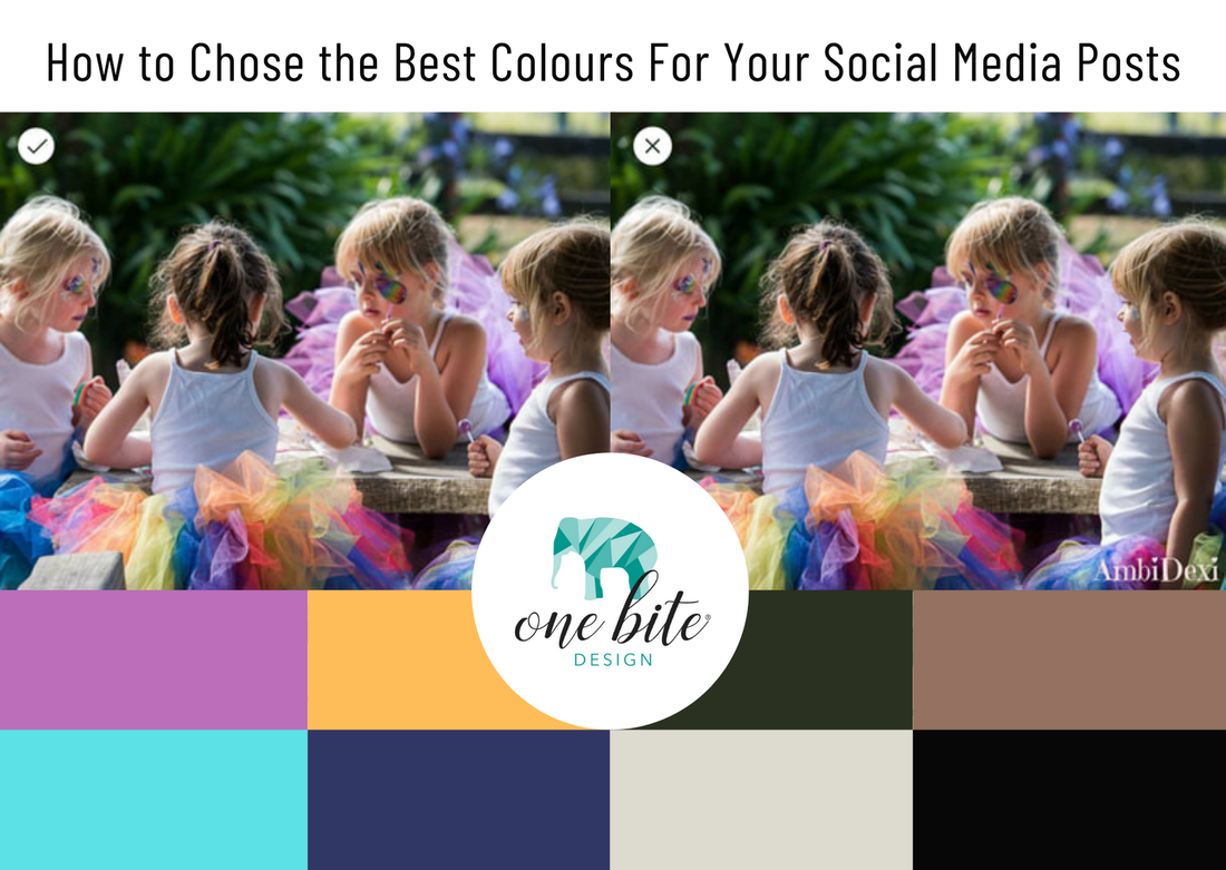
​“Help!' I hear you say, 'I’m overwhelmed!'

Never fear! Help is at hand.  Helen, at One Bite Design, with 20 years experience, knows very well what colours work best to bring out of images. If you do not have either the time or desire to pick colours from your images for your design work, get in touch with One Bite Design today and I’ll apply my creative eye and understanding of how colours work to bring out the very best with your images, logo and over all branding.
Contact Helen Now
1 Comment

Beginners Guide to Successful Branding

4/5/2021

2 Comments

 
​Successful branding occurs when your brand makes a deep connection with your followers. It’s what they use when building a relationship and developing an opinion about your business. A successful brand needs to convey messages about your business’:
  • Purpose & Vision
  • Values & Beliefs
  • Position in the Market
  • Personality
  • Tone of Voice & Language
  • Key Messages & Stories
But successful branding is more than your logo, business name or tagline. It’s more than having a flash website with all the bells and whistles, more than eye catching social media posts and more than having a recognisable brand. A business which has created a successful brand image, will be one which presents a consistent image.  
Picture

How to Achieve Successful Branding
As consistency is key in achieving a successful brand image, you first need to ensure all your ducks are in a row. This means reviewing your branding guide or having a graphic designer create one for your business. Inside this guide, you can expect to see details of the visual aspects of your brand, including your logo variations, fonts, styles and colours. A branding guide can also contain details about the vocabulary used, what can be shared on social media and other decisions about your brand’s visibility.
You then use your branding guide to ensure your brand image is consistent wherever it can be seen:
  • Logo variations are used in the right places
  • Colours used in social media are identical to your website and print advertising
  • Font usage is consistent, including both heading and paragraph fonts
By being consistent with your branding, you are helping to build recognition, loyalty and trust amongst new and existing followers. If you are the owner operator of your business, then you have the sole responsibility in using your branding guide. If you outsource your web design or social media posts, sharing a copy of your brand guide with them will ensure they too practice consistency of your business’ brand image.

Where to Next for Your Brand?
It’s always a good idea to review your branding regularly. Check that it continues to portray the same messages to your audience and resonates with them, has an appropriate appearance for your industry and has all the key visual aspects included in your brand guide. What was once suitable for your business may not be now. That’s where I can help. 

As your graphic designer, I can work with your existing brand to develop a new look or simply tweak the existing look. Big or small, my design skills will help ensure your business makes a positive first impression. Get in touch and let’s have a chat or check out my current branding packages.
2 Comments

    One Bite  Design BLOG

    Check out these amazing blogs. Loads of great information and tips.

    Categories

    All
    Branding
    Business Tips
    Graphic Design Tips
    Logo Design
    Visual Marketing

    Previous Blogs

    April 2024
    July 2021
    June 2021
    May 2021
    April 2021
    March 2021
    February 2021
    January 2021
    November 2020
    October 2020
    September 2020
    August 2020
    June 2020
    January 2019
    November 2018
    October 2018
    September 2018
    August 2018
    July 2018
    June 2018
    May 2018
    April 2018
    March 2018
    February 2018
    January 2018
    December 2017
    November 2017
    September 2017
    August 2017
    July 2017
    June 2017
    May 2017
    April 2017
    February 2017
    January 2017
    May 2016
    April 2016
    January 2016

      GET IN TOUCH

    Submit

​Home
About
Contact
​Blog

​Thanks so much for taking the time to look around the One Bite Design website.
I am your one stop branding specialist taking the stress out of your branding needs.
No job too big, no job too small... One Bite Design can happily design it all.
© Copyright One Bite Design 2024
  • Home
  • Services
    • Logo Design Brand Packages
    • Branding & Graphics
    • Print Design
    • Virtual Design Services
    • Funeral & Memorial Design
    • Photography
    • Apparel Design
  • Portfolio
    • Full Brands >
      • Bloom
    • Logo Designs
    • Photography
    • Business Card Designs
    • Apparel Design >
      • Apparel Design
  • About
    • Meet Helen
    • About One Bite
    • Testimonials
    • FAQ's
  • Contact
  • Blogs